Product Hero Section Moodboard

A reusable product hero layout with one bold promise, one proof strip, and one practical visual anchor.

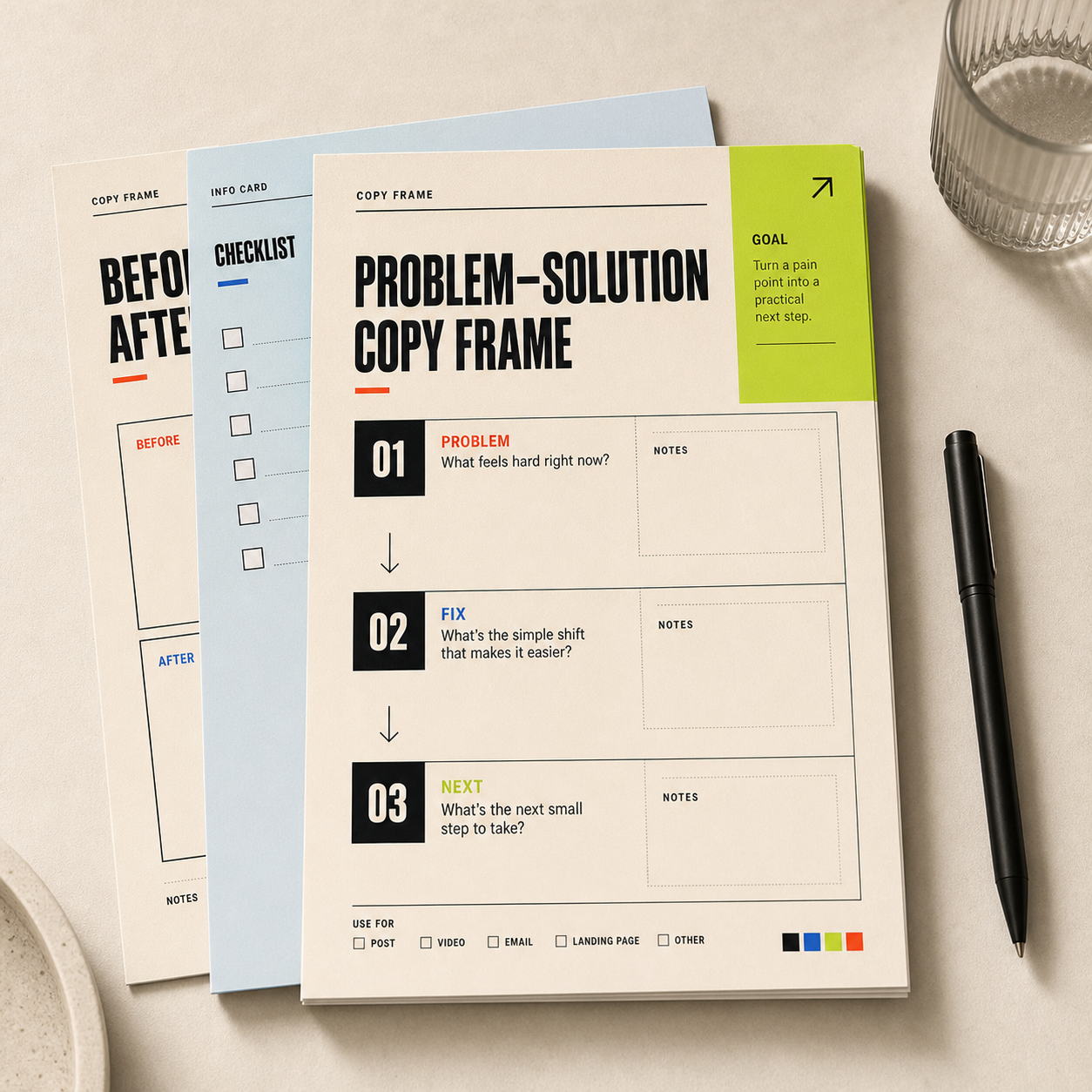
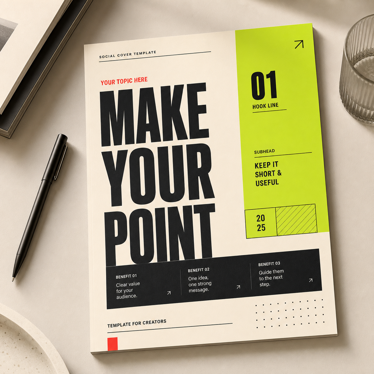
Product hero section moodboard mockup with bold headline, product panel, proof strip, and lime call-to-action.
page-section

PRODUCT HERO

Turn one offerinto a clearfirst screen

Promise, proof, action, and product visual in one reusable section.

怎么套用

01

Promise

  • Write one outcome-focused headline that says what changes for the user.
02

Proof

  • Add one short proof strip: metric, testimonial fragment, usage count, or before-after cue.
03

Action

  • Use one primary CTA and one quiet secondary link. Avoid three competing buttons.

可直接改写的例子

设计规格

颜色数值

Warm canvas

#f7f2e8 · RGB(247, 242, 232)

Full-width section background.

Hard ink

#111111 · RGB(17, 17, 17)

Headline, borders, and primary CTA text.

Trust blue

#2458ff · RGB(36, 88, 255)

Product screenshot frame or proof highlight.

Lime action

#c8ff42 · RGB(200, 255, 66)

Primary button fill or one conversion marker.

字体和字号

Hero headline

  • Use a heavy grotesk sans at 64-88px on desktop and 42-54px on mobile, 900 weight, line-height 0.95-1.05.

Support copy

  • Use 18-22px body copy, 500-650 weight, max width around 560px so the promise stays readable.

版式规则

Desktop ratio

  • Use a 58/42 split: copy on the left, product visual on the right. Keep the CTA and proof strip below the first paragraph.

Spacing

  • Use 72-96px vertical padding, 34-48px side padding, and 18-24px gaps between headline, copy, and CTA row.

制作提示

  • Use as the first viewport of a landing page, pitch deck opener, or product announcement image.
  • If recreating in Figma, keep the product mockup larger than the proof strip but smaller than the headline block.

可以替换的部分

Hero fields

  • Product name
  • Outcome promise
  • Proof metric
  • Primary CTA
  • Screenshot or template preview

Proof types

  • Used by 1,200 teams
  • Save 3 hours per week
  • Includes 24 ready-to-edit sections

不适合这样用

  • The product needs a long technical explanation first.
  • There is no visual proof or product preview yet.
  • The offer has more than one primary audience.

还能变成

  • Swap the product visual for a printed mockup.
  • Use a darker background for technical products.
  • Turn the proof strip into three compact stat blocks.

使用注意

  • Make the product visible in the first viewport.
  • Keep the CTA label concrete.
  • Do not let the screenshot overpower the promise.

适合场景

Landing pageSaaS productDigital downloadCourse page

颜色

相关灵感

继续看相近的结构、风格或使用场景。